Dmitry Sharukhin
Qualified specialist with experience in data analysis and modeling in different fields. Strong analytical skills, proficient in Excel, have Python programming experience, knowledge of pandas, sklearn, matplotlib, seaborn libraries, statistics and probability, SQL |
Have a passion to solve challenging problems using data
View My LinkedIn Profile
View My Medium Profile
BACK to homepage
Data Analysis: Cab companies performance comparison
Tags: data analysis, ETL, EDA, visualization, statistics
Project description: In this project I used my Data Analysis skills as well as knowledge of economics to analyze the data about performance of 2 companies and compare them
Data Source: https://hh.ru/
You can view full notebooks’ code here
1. Initial data preparations (notebook)
There are 4 separate files with data. And the main goal of this stage is to understand relations and external links of given files.
The final step was creating integrated dataset(s) which will be comfortable enough for analysis and data manipulation.
I ended up having integrated file containing data about trips details as well as customer and transactions info. This file I analyzed further
import numpy as np
import pandas as pd
import matplotlib.pyplot as plt
import seaborn as sns
import statsmodels as sm
import scipy.stats as stats

df = pd.read_csv('datasets/processed/merged_trips_transacts_cust.csv', index_col=0)
df['trip_date'] = pd.to_datetime(df['trip_date'])
df.info()

Then I added some calculated features which will be useful for further analysis
# additional specific (unit) features (indicators)
df['revenue_per_km'] = df['amount_received'] / df['trip_distance']
df['cost_per_km'] = df['trip_cost'] / df['trip_distance']
df['profit_per_trip'] = df['amount_received'] - df['trip_cost']
df['profit_per_km'] = df['profit_per_trip'] / df['trip_distance']
2. Analysis of overall companies’ characteristics (notebook)
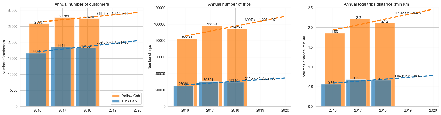
At this step my main intention was to reveal high-level trends in behaviour of some indicators which define the situation in company. First indicators were annual number of customers, trips and total trip length
Next I saw at indicators in monetary terms. Here are the results:
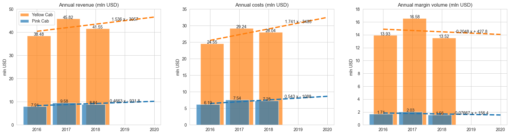
The most interesting insight is that margin indicators have a decreasing trend for both companies
From these charts we can make following conclusions:
- Both companies have similar annual dynamics patterns in number of trips, trips total distance and amount received
- ‘Yellow Cab’ company is about 3 times bigger than ‘Pink Cab’ in terms of total number of trips, trips distance and revenue (amount received from known trips)
- ‘Yellow Cab’ has total amount of profit about 7-8 times bigger than ‘Pink Cab’ company
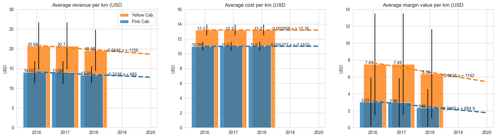
To ensure these conclusions are correct I had tested if differences in median values are statistically significant. Here I’ll show this check by the example of unit indicators: revenue_per_km.
# For 'revenue_per_km'
fig, axs = plt.subplots(1, 3, figsize=(15, 5))
fig.suptitle('Distributions checks for `revenue_per_km` feature')
sns.histplot(data=df, x='revenue_per_km', hue='company', bins=50, ax=axs[0])
stats.probplot(df[df['company'] == 'p']['revenue_per_km'], dist="norm", plot=axs[1])
stats.probplot(df[df['company'] == 'y']['revenue_per_km'], dist="norm", plot=axs[2])
axs[0].set_title('Histograms of feature distributions')
new_labels = ['Pink Cab', 'Yellow Cab']
leg = axs[0].get_legend()
for t, l in zip(leg.get_texts(), new_labels): #ax.legend.texts
    t.set_text(l)
axs[1].set_title('Normality check for `Pink Cab`')
axs[2].set_title('Normality check for `Yellow Cab`');
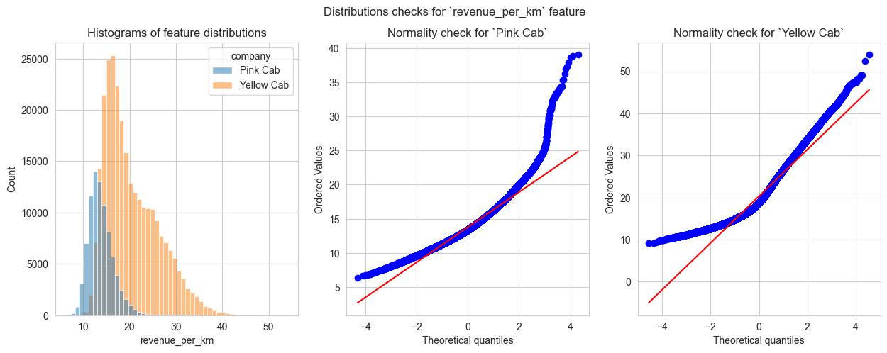
So, both distributions are obviously non-normal. Then I check if distributions are the same
y_quantiles = []
p_quantiles = []
for i in range(101):
    y_quantiles.append(df[df['company'] == 'y']['revenue_per_km'].quantile(q=float(i)/100.0))
    p_quantiles.append(df[df['company'] == 'p']['revenue_per_km'].quantile(q=float(i)/100.0))

fig, ax = plt.subplots(1, 1, figsize=(7, 7))
ax.scatter(x=y_quantiles, y=p_quantiles, c='blue')
ax.plot([0, 60], [0, 60], c='red')
ax.set_xbound(lower=0, upper=60)
ax.set_ybound(lower=0, upper=60)
ax.set_xlabel("`Yellow Cab` revenue per km quantiles")
ax.set_ylabel("`Pink Cab` revenue per km quantiles")
ax.set_title('QQ plot for `Revenue per km` feature distributions');
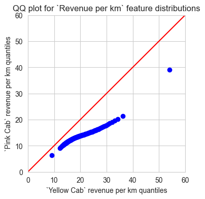
And no, they are not. So I used Kruskal-Wallis test to determine if median values of both distributions are the same
stats.kruskal(df.loc[df['company'] == 'p', 'revenue_per_km'], df.loc[df['company'] == 'y', 'revenue_per_km'])

# Output:
# KruskalResult(statistic=108321.74336195752, pvalue=0.0)
P-value of the test shows that both companies have statistically significant difference in median values of ‘revenue per 1 km’ indicator
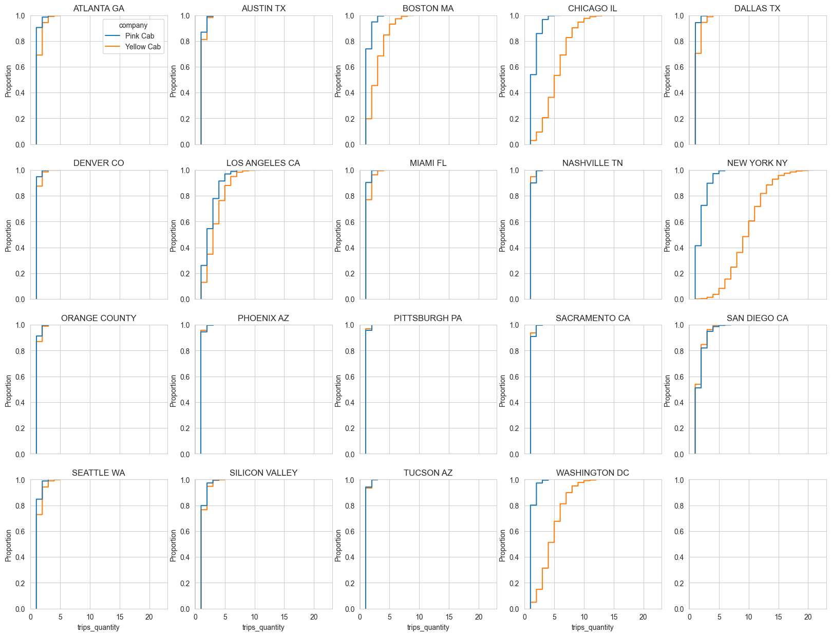
Another interesting insight is that there are several cities where number of trips per 1 client cumulative distributions showed significant difference between companies
# filtering dataset: only 2018, calculating number of trips by each customer
df_for_plot = df[(df['trip_date'].dt.year == 2018)].groupby( #df['city'].isin(cities_to_check) &
        by=['company', 'city', 'customer_id']
    ).agg({
        'transaction_id': 'count'
    }).reset_index().rename(columns={'transaction_id': 'trips_quantity'})

fig, axs = plt.subplots(4, 5, figsize=(20, 15), sharex=True)
for ax, city in zip(axs.flatten(), df_for_plot['city'].unique()):
    sns.ecdfplot(data=df_for_plot[df_for_plot['city'] == city], x='trips_quantity', hue='company', ax=ax)
    ax.set_title(city)
    if np.where(axs.flatten() == ax)[0] == 0:
        new_labels = ['Pink Cab', 'Yellow Cab']
        leg = ax.get_legend()
        for t, l in zip(leg.get_texts(), new_labels):
            t.set_text(l)
        #leg.set_loc('lower right')
        #ax.legend(loc='lower right')
    else:
        ax.get_legend().remove()
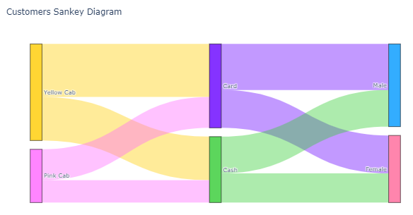
And finally I’ll show the visualizzation of payment type ratios and gender ratios
links_opacity = 0.4
node_colors = ['rgba(0, 0, 255, 0.8)'] * len(sankey_node_labels)
color_replacements = {
    'Yellow Cab': 'rgba(255, 204, 0, 0.8)',
    'Pink Cab': 'rgba(255, 102, 255, 0.8)',
    'Card': 'rgba(102, 0, 255, 0.8)',
    'Cash': 'rgba(51, 204, 51, 0.8)',
    'Male': 'rgba(0, 153, 255, 0.8)',
    'Female': 'rgba(255, 102, 153, 0.8)'
}
# replacing default 'blue' by custom color in color_replacements
for key in color_replacements.keys():
    node_colors[sankey_node_labels.index(key)] = color_replacements[key]

# coloring link by source color
links_color = [node_colors[x].replace('0.8', str(links_opacity)) for x in sankey_links['source']]

fig = go.Figure(data=[go.Sankey(
    node = {
        'pad': 15,
        'thickness': 20,
        'line': {'color': 'black', 'width': 0.5},
        'label': sankey_node_labels,
        'color': node_colors
    },
    link = {
        'source': sankey_links['source'], # indices correspond to labels, eg A1, A2, A1, B1, ...
        'target': sankey_links['target'],
        'value': sankey_links['value'],
        #'label': ['l1', 'l2', 'l3', 'l4', 'l5', 'l6'],
        'color': links_color
    }
)])

fig.update_layout(title_text="Customers Sankey Diagram", font_size=10)
Conclusion
In this project I used my Data Analysis skills as well as knowledge of economics to analyze the data about performance of 2 companies and compare them.
Notebook with full analysis and all visualisations is available here