Dmitry Sharukhin
Qualified specialist with experience in data analysis and modeling in different fields. Strong analytical skills, proficient in Excel, have Python programming experience, knowledge of pandas, sklearn, matplotlib, seaborn libraries, statistics and probability, SQL |
Have a passion to solve challenging problems using data
View My LinkedIn Profile
View My Medium Profile
BACK to homepage
Bank Marketing Campaign Project
Tags: EDA, pipelines, binary classification, clustering, imbalanced dataset
Project description: The main goal was to build a model which will help bank distinguish between clients who are likely to open savings account and those who are not. In this project the augmented version of dataset with was used
Data Source: https://archive.ics.uci.edu/ml/datasets/Bank+Marketing
You can view project’s code here
1. Splitting Dataset to train and test parts (notebook)
Before the EDA process I had to split the dataset to train and test parts. This was done to ensure unbiased testing of the resulting model as seeing test data while performing EDA could lead to some biases in assumptions and implementation.
The only thing to check was the distribution of target labels
import pandas as pd
from sklearn.model_selection import train_test_split

df = pd.read_csv('datasets/bank-additional-full.csv', sep=';')
# target labels are in 'y' column
fig, ax = plt.subplots(1, 1, figsize=(7, 5))
ax.barh(y=df['y'].value_counts(normalize=True).index, width=df['y'].value_counts(normalize=True).values, color=[sns.color_palette('pastel')[1], sns.color_palette('pastel')[0]])
ax.set_ylabel('Target value')
ax.set_xlabel('% of number of observations')
ax.set_xticks(np.arange(0.0, 1.1, 0.1))
ax.set_xticklabels([int(x*100) for x in np.arange(00.0, 1.1, 0.1)])
ax.spines['right'].set_visible(False);
ax.spines['top'].set_visible(False)4
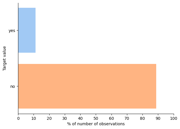
This check showed that the dataset is highly imbalanced so I used stratified splitting to ensure similar ratios of positive and negative labels in train and test sets
df_train, df_test = train_test_split(df, test_size=0.3, stratify=df['y'], random_state=42)

print('Initial dataset target labels ratio: {:.3f}'.format(len(df[df['y']=='yes'])/len(df)))
print('Train set target labels ratio: {:.3f}'.format(len(df_train[df_train['y']=='yes'])/len(df_train)))
print('Test set target labels ratio: {:.3f}'.format(len(df_test[df_test['y']=='yes'])/len(df_test)))

# output:
# Initial dataset target labels ratio: 0.113
# Train set target labels ratio: 0.113
# Test set target labels ratio: 0.113

df_train.to_csv('datasets/bank-train.csv', index=False)
df_test.to_csv('datasets/bank-test.csv', index=False)
Then I left the test set untouched until model testing stage
2. EDA (notebook)
EDA was performed only on training part of data set.
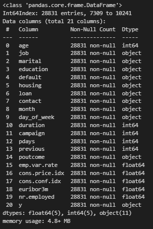
First I checked dataset total info
df.info()
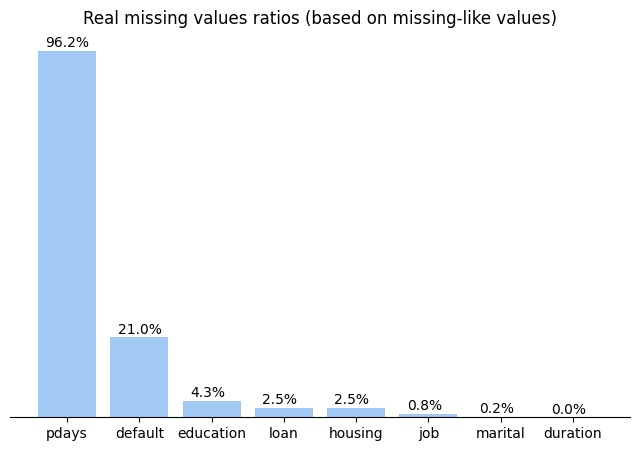
The dataset has 21 columns. And they seem to have no missing values but after deeper exploration I detected 2 kinds of NAN-like values. They were ‘unknkown’ for category columns and 999 for numeric columns. So let’s check for real ratios of missing values:
# checking real number of missing values left
cat_nan_equiv = 'unknown'
num_nan_equiv = 999
real_nans = {}
print(f'Calculating real NaNs ratio using `{cat_nan_equiv}` and `{num_nan_equiv}` keyvalues:')
print('Column (value) \t\tNvalues \tRatio')
print('-'*40)
for col in df.columns:
    if df[col].dtype == 'object':
        nan_equiv = cat_nan_equiv
    else:
        nan_equiv = num_nan_equiv
    if nan_equiv in list(df[col]):
        freq_table = df[col].value_counts()
        real_nans[col] = [freq_table[nan_equiv], 100 * freq_table[nan_equiv] / len(df)]
        print('{} (`{}`) \t{} \t{:.1f}%'.format(col, nan_equiv, freq_table[nan_equiv], 100 * freq_table[nan_equiv] / len(df)))
And plot them on chart
x = []
y = []
for col, val in real_nans.items():
    x.append(col)
    y.append(val[1])
x = [i for _, i in sorted(zip(y, x), key=lambda pair: pair[0])[::-1]]
y = sorted(y)[::-1]
fig, ax = plt.subplots(1, 1, figsize=(8, 5))
ax.bar(x=x, height=y, color=sns.color_palette()[0])
for a_x, a_val in enumerate(y):
    ax.annotate('{:.1f}%'.format(a_val), xy=(a_x-0.3, a_val+1))
ax.set_title('Real missing values ratios (based on missing-like values)')
ax.spines['top'].set_visible(False)
ax.spines['right'].set_visible(False)
ax.spines['left'].set_visible(False)
ax.set_yticks([]);
To understand predictive power of features in dataset I will use Weight-of-Evidence (WoE) approach. It also will help me to get rid of nan-like values by providing numeric values to replace nans with.
As the dataset is highly imbalanced I have to keep as much records as I can to provide the amount of data to train models. WoE approach will also help me to do this as it can handle NaNs and nan-like values separately
Before I can perform calculations I should transform target values to numerric format
# replacing string values in target with integers to ease further analysis
target_positive = 1
target_negative = 0
df['y'] = df['y'].map({'yes': target_positive, 'no': target_negative})
Now I will implement function which will provide all the calculations needed
def get_woe_cat(X, y, return_details=False):
    """
    Calculates Weight-of-Evidence indicator and returns its values (with additional details if asked)
    Input: X - pd.Series of independent values
    y - pd.Series of target values (0-negative, 1-positive)
    """
    num_events_total = y.sum()
    num_nonevents_total = len(y) - num_events_total
    grouper = pd.DataFrame({'feature': X, 'target': y}).groupby('feature', as_index=True)

    num_total = grouper['target'].count().to_numpy()
    num_events = grouper['target'].sum().to_numpy()
    index = grouper['target'].sum().index

    num_nonevents = num_total - num_events
    events_share = num_events / num_events_total
    nonevents_share = num_nonevents / num_nonevents_total
    woe = np.log((events_share+0.001) / (nonevents_share+0.001)) # adding small value to nominator and denominator to exclude division by 0 error
    iv = (events_share - nonevents_share) * woe

    if return_details:
        return (
            pd.DataFrame({
                    'num_events': num_events,
                    'num_nonevents': num_nonevents,
                    'num_cat_total': num_total,
                    'events_share': events_share,
                    'nonevents_share': nonevents_share,
                    'woe': woe,
                    'iv': iv
                },
                index = index
            ),
            iv.sum()
        )
    else:
        return (pd.Series(woe, index=index, name='woe'), iv.sum())
And now I can visualize the predictive power of features
ivs = []
cols = []
for col in df.select_dtypes(include='object').columns.difference(other=['y']):
    (woe, iv) = get_woe_cat(df[col], df['y'])
    cols.append(col)
    ivs.append(iv)
idxs = np.argsort(np.array(ivs))
cols = np.array(cols)[idxs][::-1]
ivs = np.array(ivs)[idxs][::-1]

# plotting predictive power based on woe value
plt.bar(x=cols, height=ivs)
plt.plot([-0.5, len(ivs)+0.5], [0.02, 0.02], 'r--', lw=0.5)
plt.plot([-0.5, len(ivs)+0.5], [0.1, 0.1], 'r--', lw=0.5)
plt.plot([-0.5, len(ivs)+0.5], [0.3, 0.3], 'r--', lw=0.5)
plt.plot([-0.5, len(ivs)+0.5], [0.5, 0.5], 'r--', lw=0.5)
plt.annotate('weak', xy=(len(ivs)+0.5,0.05), ha='right')
plt.annotate('medium', xy=(len(ivs)+0.5,0.2), ha='right')
plt.annotate('strong', xy=(len(ivs)+0.5,0.4), ha='right')
plt.annotate('suspicious', xy=(len(ivs)+0.5,0.51), ha='right')
ax = plt.gca()
for a_x, a_val in enumerate(ivs):
    plt.annotate('{:.4f}'.format(a_val), xy=(a_x-0.4, a_val+0.01), fontsize=7)
plt.xticks(rotation=35, ha='right')
ax.spines['top'].set_visible(False)
ax.spines['right'].set_visible(False)
ax.spines['left'].set_visible(False)
ax.set_yticks([])
ax.set_ybound(upper=0.6)
plt.title('Predictive power of features based on WoE evaluation');
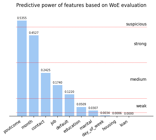
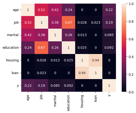
Then I analyzed all features in detail and checked their correlations.
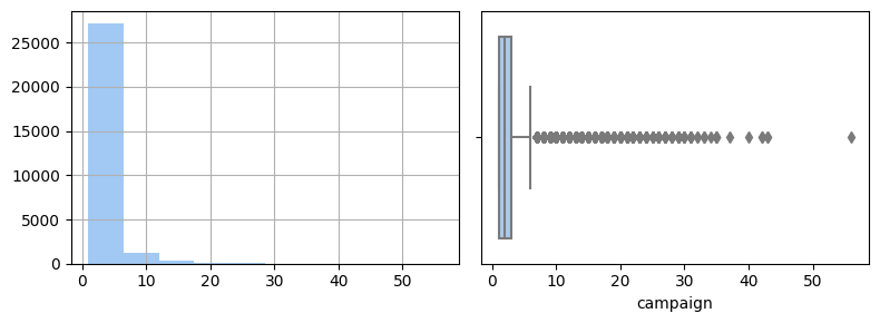
For some features I cut-off tails in their distributions to make it more convenient for predictions. For example, for campaign feature I got this picture of distribution
# check distribution
fig, axs = plt.subplots(1, 2, figsize=(8, 3), sharex=True)
df['campaign'].hist(ax=axs[0])
# check distribution by boxplot + identifying outliers
sns.boxplot(data=df, x='campaign', ax=axs[1])
fig.tight_layout();
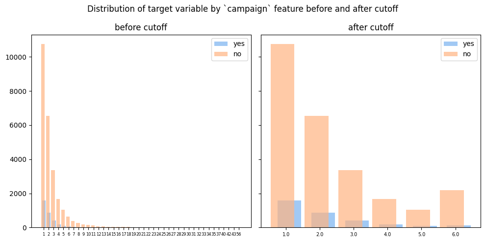
I determined cut-off value as Q3 + 1.5*IQR and treated all values greater than it as outliers. So I replaced them with cut-off value
# consider outliers as values > Q3 + 1.5*IQR
q1 = df['campaign'].quantile(0.25)
q3 = df['campaign'].quantile(0.75)
iqr = q3 - q1
cutoff_val = q3 + 1.5 * iqr
print(f'Q1  = {q1}')
print(f'Q3  = {q3}')
print(f'IQR = {iqr}')
print(f'Cutoff value: {cutoff_val}')

# output:
# Q1  = 1.0
# Q3  = 3.0
# IQR = 2.0
# Cutoff value: 6.0

fig, ax = plt.subplots(1, 2, figsize=(10,5), sharey=True)
ct = pd.crosstab(df['campaign'], df['y'])
ax[0].bar(x=[x+0.1 for x in range(len(ct.index))], height=ct[target_positive], width=0.7, label='yes')
ax[0].bar(x=[x-0.1 for x in range(len(ct.index))], height=ct[target_negative], width=0.7, alpha=0.7, label='no')
ax[0].set_xticks(range(len(ct)))
ax[0].set_xticklabels(ct.index, fontsize=6)
ax[0].legend()
ax[0].set_title('before cutoff')

ct = pd.crosstab(df['campaign'].apply(lambda x: np.min([x, cutoff_val])), df['y'])
ax[1].bar(x=[x+0.1 for x in range(len(ct.index))], height=ct[target_positive], width=0.7, label='yes')
ax[1].bar(x=[x-0.1 for x in range(len(ct.index))], height=ct[target_negative], width=0.7, alpha=0.7, label='no')
ax[1].set_xticks(range(len(ct)))
ax[1].set_xticklabels(ct.index, fontsize=7)
ax[1].legend()
ax[1].set_title('after cutoff')
fig.suptitle('Distribution of target variable by `campaign` feature before and after cutoff')
fig.tight_layout();
As a result of EDA I was able to keep all records and understood what transformations to appply (or not) to each feature in dataset.
As I have separate test dataset I decided to implement pipeline to deal with this situation and guarantee that train and test sets will be transformed in identical way
3. Implementing pipeline (notebook)
Before implementing pipeline I created all the data mappings and simple transformation I needed
# definition of inputs for binning and encoding
age_bins = pd.IntervalIndex.from_breaks(np.arange(15, 110, 10))
pdays_bins = pd.IntervalIndex.from_breaks([-1, 3, 6, 13, 50, 999], closed='right')
default_map = {'yes': 1, 'no': 0, 'unknown': 0}
housing_map = {'yes': 1, 'no': 0, 'unknown': 1}
loan_map = {'yes': 1, 'no': 0, 'unknown': 0}
contact_map = {'cellular': 1, 'telephone': 0}
month_map = {'mar':3, 'apr':4, 'may':5, 'jun':6, 'jul':7, 'aug':8, 'sep':9, 'oct':10, 'nov':11, 'dec':12}
dow_map = {'mon':1, 'tue':2, 'wed':3, 'thu':4, 'fri':5}
poutcome_map = {'nonexistent': 0, 'success': 1, 'failure': -1}

# cutoff functions
cutoff_campaign = (lambda x: np.min([x, 6])) # value 6 was calculated in 2_eda for `campaign` feature as cutoff value
cutoff_previous = (lambda x: np.min([x, 3])) # value 3 was calculated in 2_eda for `previous` feature as cutoff value
cutoff_pdays = (lambda x: np.min([13, x])) # value 13 was calculated in 2_eda for `pdays` feature as cutoff value
binarize_pdays = (lambda x: int(x < 999)) # transforming to answer on question: was there a previous contact?
Pipeline implementation looks as follows
# using simple encoding + partial WoE
preproc_enc_woe_part = [
    'encoding, WOE partial, imputing, cutoff',
    Pipeline([
        ('binning', DFColumnBinning(bins_dict={'age': age_bins}, new_names=['age_bins'])),
        ('cross-impute', DFCrossFeaturesImputer(cross_features={'education': 'job', 'job': 'education', 'marital': 'age_bins'}, nan_equiv=cat_nan_equiv)),
        ('replace_values', DFValuesReplacer(replaces={'default': {cat_nan_equiv: 'no'}, 'housing': {cat_nan_equiv: 'yes'}, 'loan': {cat_nan_equiv: 'no'}, 'pdays': {num_nan_equiv: -1}})),
        ('map_values', DFValuesMapper(map_values={'contact': contact_map})),
        ('encode_woe_cat', DFWoeEncoder(
            columns=[
                'job', 'marital', 'education', 'default', 'housing', 'loan', 'month', 'day_of_week', 'poutcome', #'pdays_bins'
            ], encode_nans=True, nan_equiv=cat_nan_equiv
        )),
        ('cutoff', DFFuncApplyCols(map_func={
            'campaign': cutoff_campaign,
            'previous': cutoff_previous,
            'pdays': cutoff_pdays,
        })),
        #('encode_woe_num', DFWoeEncoder(columns=['campaign', 'previous'], encode_nans=True, nan_equiv=num_nan_equiv)),
        ('drop_cols', DFDropColumns(columns=['age_bins', 'duration'])), # try to drop columns with high correlation (`nr.employed` and `emp.var.rate`)
    ])
]
Here I used some custom classes made to be compatible with scikit-learn Pipeline class. You can see all these classes here and read about implemeentation example in my Medium post.
4. Testing models (notebook)
I chose some classifiers to test and used GridSearchCV class from scikit-learn to perform some basic fine-tuning
classifiers = [
    ('logistic_regression', Pipeline([
            ('scale', MinMaxScaler()),
            ('clf', LogisticRegression(C=1.0, penalty='l2', solver='lbfgs', class_weight='balanced', max_iter=1000)),
        ])
    ),
    ('sgd', Pipeline([
            ('scale', MinMaxScaler()),
            ('clf', SGDClassifier(class_weight='balanced', random_state=42, loss='hinge')), # added after evaluation #loss='log_loss'
        ])
    ),
    ('random_forest', RandomForestClassifier(n_estimators=100, class_weight='balanced')),
    ('knn', KNeighborsClassifier(n_neighbors=3)),
]
grid_params = {
    'logistic_regression': {'clf__C': np.logspace(-3, 2, 6)},
    'random_forest': {'max_depth': [x for x in range(2, 7, 2)]},
    'knn': {'n_neighbors': [x for x in range(2, 6)]},
    'sgd': {'clf__loss': ['hinge', 'log_loss']},
}
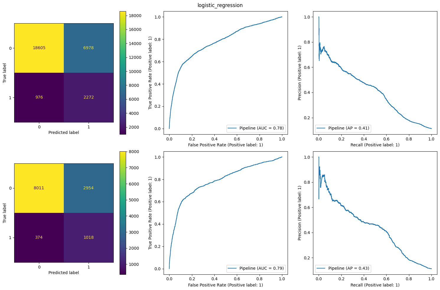
I used “recall” metric to train classifiers because in this task False Negatives (missing profit for the bank) is much more important than False Positives (additional resultless calls)
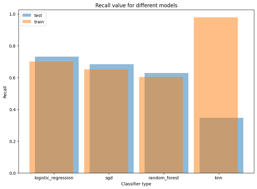
The result of LogisticRegression model was the best. So I showed its charts
4. Alternative way: Clustering (notebook)
There is another approach to solving this task. It is based on clustering algorithm.
I tried to visualize possible clusters using t-SNE algorithm. The result is shown below
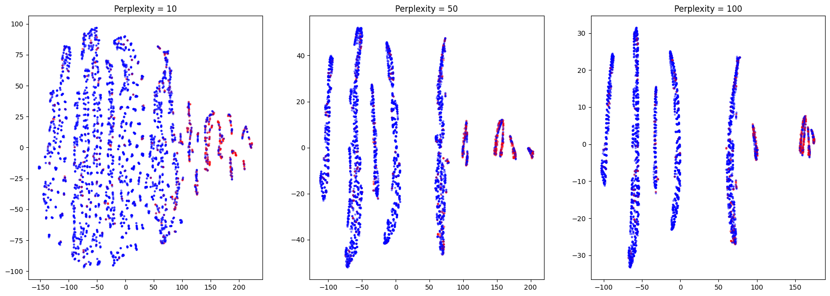
On this picture we can clearly see several clusters with different density of red (positive) dots. Let’s evaluate the probability of getting positive outcome in each cluster
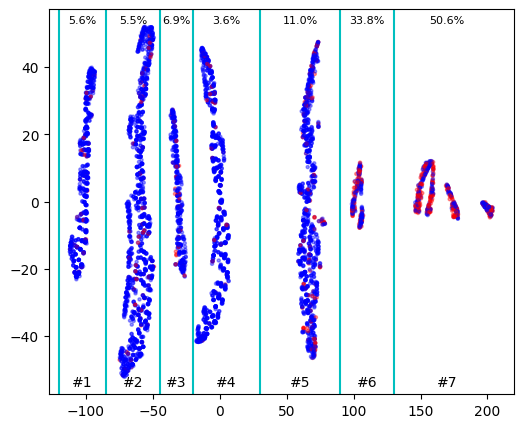
So the probability of positive outcome significantly varies between clusters and we can use this information to train correct clustering algorithm by choosing appropriate initial points. We can take, for example, points from clusters 1, 5, 6 and 7 and define number of clusters as 4. Or we can take points from clusters 1, 5 and 7 and search for 3 clusters (most probably in this case clusters 5 and 6 will be united)
initial_points_idxs = [
    df_tsne[df_tsne['x'] < -85].index[0],
    df_tsne[(df_tsne['x'] > 30) & (df_tsne['x'] < 90)].index[0],
    df_tsne[df_tsne['x'] > 130].index[0]
]

kmeans = KMeans(n_clusters=3, init=[df.loc[i] for i in initial_points_idxs])
kmeans.fit(df)
df['cluster'] = kmeans.predict(df)
for i in range(3):
    density = df[df['cluster'] == i]['y'].mean()
    print(f'#{i+1} : {density*100:.1f}%')

df_test = pd.read_csv('datasets/processed/bank-train-encoded.csv', comment='#')
df_test['cluster'] = kmeans.predict(df_test)
for i in range(3):
    density = df_test[df_test['cluster'] == i]['y'].mean()
    print(f'#{i+1} : {density*100:.1f}%')

# output (probability of success in predicted clusters on test data):
# 1 : 5.0%
# 2 : 16.1%
# 3 : 48.6%
As a result we was able to train clustering model which will predict which cluster each customer belongs to and therefore the probability of success.
Then bank should organize calls depending on probability of success and time available for campaign